Submitting more applications increases your chances of landing a job.
Here’s how busy the average job seeker was last month:
Opportunities viewed
Applications submitted
Keep exploring and applying to maximize your chances!
Looking for employers with a proven track record of hiring women?
Click here to explore opportunities now!You are invited to participate in a survey designed to help researchers understand how best to match workers to the types of jobs they are searching for
Would You Be Likely to Participate?
If selected, we will contact you via email with further instructions and details about your participation.
You will receive a $7 payout for answering the survey.
Register now or log in to join your professional community.
Every floor has identical panels. The customer, a construction contracting company, has provided specifications for the installations. The team is using a process to install and verify each panel. As the team completes each panel, your team's quality control inspector measures it and identifies defects. The root cause of each defect is identified. You want to identify the ongoing trends of defective installations. Which is the BEST tool to use for this? A. Run chart B. Pareto chart C. Control chart D. Fishbone diagram

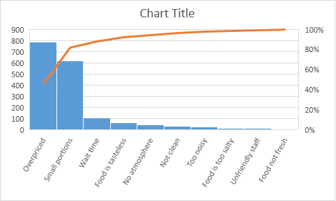
The required is to track the number of defective installtion classified by type. Pareto Chart is the right option. Pareto chart consists of a curve that represents the comulative number of defective installtions, and a bar chart that shows the number of each type of defects. Attached is an example of Pareto chart to trach defects in a food procuction process.


Answer: AExplanation: Run charts tell you about trends in your project by showing you what your data looks like as a line chart. If the line in the chart were the number of defects found in your product through each quality activity, that would tell you that things were getting worse as your project progressed. In a run chart, you are looking for trends in the data over time.


