أنشئ حسابًا أو سجّل الدخول للانضمام إلى مجتمعك المهني.


Identify your objective that will achieved by the App (Your requirements)
Designing Phase, UI (user Interface design) can be start from basic wire farming technique then you can design it in Adobe Illustrator/Photoshop or Fire work. Design should be much simpler as it possible, easy to use and easy to understand.
Start from basic flow-chart, write a basic algorithm and develop.
After the development phase, you have to test the app, you can share with your friends or colleagues, accept their reviews, comments, suggestion and fix the error/bug. After this phase your app is ready to publish on the internet.

Just because you have less screen space doesn’t mean the rules of good interaction design don’t apply.
Let’s review the Five Pillars of Interaction Design again here before we dive into tips on creating usable native app interfaces.
As Andrew Maier points out in his excellent UX Booth article, these five rules are the foundation you should consider before embarking on designing any kind of interaction, whether or not it’s for a native app.
2. How to design better mobile apps? Know Your UsersScreen size isn’t the only constraint in mobile design. According to Maier, users form the basis of your interface’s constraints. So the first step in creating a goal-driven app UI is to know your users.
Photo Credit: Kārlis Dambrāns, Creative Commons 2.0
There are three fundamental tactics for understanding your users, as highlighted in the free Guide to UX Design Process and Documentation:
Doing this upfront will save you headaches down the road, as Google Venture’s Braden Kowitz points out:
“So replace the startup dogma of ‘launch early and often’ with ‘learn early and often.’ For me, it opened my mind to all the different kinds of ways startups can learn, and how valuable user research can be to the core mission of any startup.”
In other words, make sure you conduct usability testing sessions between each major iteration. At a bare minimum, run some remote usability tests with a service like UserTesting so you can see how people use your app in natural settings. For more insights into behavior nuances (e.g. gestures and body position), we recommend running an in-person lab session with at least five users.
To learn more, usability expert Jeff Sauros offers some excellent advice for mobile usability testing.
3. The best User Experience design starts mapping out the Content and building User FlowsDesign and research work in parallel. For example, you can quickly sketch out user flows based on what you’ve learned thus far. Before committing to a path, however, create a simple prototype. It doesn’t have to be anything fancy — your prototype can be done on paper so you can start understanding how users flow between content and actions.
Photo Credit: Rodolphe Courtier, Creative Commons 2.0
If you want to outline the flow, you can use the writing-first approach, which Jessica Downey writes about in her excellent article “Jumpstarting Your App Conception Without Sketching UI.” This outlining method helps flesh out app ideas and build a “common understanding” of each page of your app.
Let’s create one for, say, a banking app. The scenario: someone wants to turn on auto deposit.
Auto-deposit off
[Set auto-deposit]
Select Deposit Frequency
[Once per month][Twice per month]
[Every other week][Every week]
Deposit
Once Per Month
[Select calendar day]
Set Amount
[Enter amount]
[Set auto-deposit]
Before sketching or prototyping, a written outline helps you explore the most important part of your app – the content. Building flows around content gives you a much more accurate assessment of the total number of pages required for your app.
As a next step, you could then create a sketch for each page of your flow (in this case, you could create four sketches). From there, you could continue iterating the sketches on paper and cut them out for a paper prototype, or move to a digital prototyping tool like UXPin.
The outline helps you quickly explore different page flows. The sketches bring those flows to life with more detail around layout and structure. Finally, a quick prototype helps you test those ideas with users.
4. Enhance Usability With Familiar Mobile PatternsMobile design revolves around many device-specific nuances , such asthumb placement, and orientation and posture.
Examine popular interfaces and study the common mobile patterns, such as slide-out nav (see below). This will allow you to create a UI that makes users “feel at home,” according to the Treehouse Blog.

Image Source: UXPin, via Lyft
We’re not suggesting that you flat-out copy the designs of others. Use common UI patterns as a baseline for usability, then layer on your own creativity. In doing so, you’ll ensure that your app design matches user expectations without feeling boring.
As showcased in the free e-book Mobile UI Design Patterns, there are two categories of interaction design patterns you must master for good mobile design.
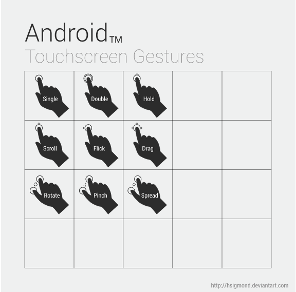
Image Source: “Android UI Design — Touchscreen Gestures,” hsigmond,Creative Commons 3.0
Mobile interaction patterns help dictate the layout of common interface elements. For example, navigation buttons at the bottom of the screen areeasier for users to tap with a thumb than buttons at the top.
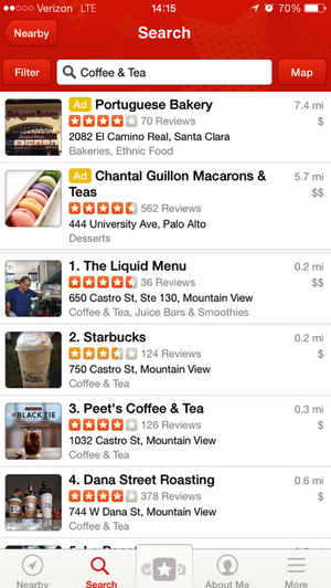
Image source: UXPin, via Yelp iOS app
Yelp is a good example of intuitive mobile interaction design. The app is very clean, with nice, big buttons that state their purpose. The buttons’ clear labels are easily understood by just about any user. Much more than that, the app uses some common mobile UI patterns, like the toolbar at the bottom, which is a pattern you’ll see in a lot of native apps.
Speaking of text, you’ll want to make sure that copy is always easy to understand. Some tips for text:
Check out the UI libraries capptivate and Use Your Interface for excellent interface examples that incorporate all the gestural, animated, and textual nuances of mobile design.
5. Don’t forget Accessibility: design For Fat FingersFingers are much thicker than pixel-precise mouse cursors, so you should pay attention to finger-friendly design.
Specifically, allow enough space for users to tap with a fingertip. If your buttons are too small or bunched too closely together, users can’t tap them accurately (which only increase frustration and therefore abandonment).
Here are a few tips to keep in mind when designing buttons and other touch targets:
The 44-pixel guideline isn’t always true. You don’t want to design a button so big that folks won’t think of it as an action, as Steven Hoober warns. Nevertheless, you should factor in people’s fingers and how they’ll interact with your app.
6. Web design trends: Don’t Discount Gradients and Shadows Just YetFlat is the new black ever since Apple ditched skeuomorphism.
But that doesn’t mean that shadows and gradients are dead. They’ve creeped their way back into design. Just look at Google’s Material Design to see how they’ve made a strong comeback.

Most Important in every software Product whether you are going to create web App or mobile is user Interaction Once you Acheive the user interaction then app will be famous
In User Interaction like easy to use and looking good desing

1. Keep in ming which type of the application you wanted to make,
2. select language and development tool which you knoe you best,
3. focus no making simple and easy to use app
4. to do that first make a flow of concept of app
5. then make a sketch of app in paint like software or in notebook
6. now discuss the concept and working flow with team mombers or your friends also try to show that to the user like people who will going to use the app in future and make best user interface and quality app
7. here you go ->>> start making the app with your maximum effort.

perfect interface
no bugs or lag
runs smooth
small data usage

Follow guidelines from this site. Always plan first and then apply the appropriate software achitecture and design pattern to code your application.

If you’re a graphic artist, make sure you learn about each platform, their navigation paradigms, and their visual language. You will find subtle differences that make a great difference in usability.

design screens for your application first and study the flow for the application.

well understanding your requirement, who your target users are, currently most using UI kit, rich graphics & text, animations, responsive UI and most important is trying to examining your app more as per user perspective and make it as simple as possible so user doesn't need to going through detailed instructions or guides during first-time using of an app .

It depends upon your expectation from the app.
If yu would make an app which is functionally perfect or which gives better GUI with functionality.
If you choose first option then excluding design make it perfect functional by coding,if you choose second then you have to decompose into funcional object with design and ntegrate it for final design.

make userfriendly app with all requirement fulfill.
proper marketing and selling.


هل تحتاج لمساعدة في كتابة سيرة ذاتية تحتوي على الكلمات الدلالية التي يبحث عنها أصحاب العمل؟